In today’s digital landscape, a strong online presence is crucial for businesses and individuals. A well-designed and user-friendly website can significantly impact your brand image and attract more visitors. This blog post will guide you through revamping your online presence by doing a website redesign with page builders.
Selecting the Right Page Builder
When it comes to redesigning your website, choosing the right page builder is crucial. Here are some key considerations to help you make an informed decision:
Consider your specific needs and requirements
Take some time to evaluate what you want to achieve with your website redesign. Are you looking for a simple and user-friendly platform or a more robust and customizable solution? Consider factors such as your technical expertise, budget, scalability, and the level of control you desire over your website.
Compare popular page builders such as WordPress, Wix, and Squarespace
These platforms are widely recognized and offer powerful website-building capabilities. Each has its own strengths and caters to different needs:
- WordPress: Known for its flexibility and extensive range of plugins and themes, WordPress is a popular choice for both beginners and advanced users. It offers great customization options and supports various integrations.
- Wix: Wix is a user-friendly platform that provides drag-and-drop functionality, making it easy to create visually appealing websites. It offers a wide selection of templates and has built-in features for e-commerce, blogging, and more.
- Squarespace: Squarespace is known for its sleek and modern designs. It offers beautiful templates and a user-friendly interface. It is ideal for creative professionals, artists, and small businesses.
Look for features like customization options, responsive design, and integration capabilities
Ensure that your page builder provides the necessary features to meet your specific requirements. Some essential features to consider include:
- Customization options: Look for a page builder that allows you to easily customize the design, layout, colors, and fonts of your website. The ability to personalize your website ensures that it aligns with your brand identity.
- Responsive design: With the increasing use of mobile devices, it’s crucial to have a website that looks and functions well on different screen sizes. Choose a page builder that offers responsive design options to create a mobile-friendly website.
- Integration capabilities: Consider the integrations you may need, such as email marketing platforms, CRM systems, or social media tools. Ensure that the page builder supports integrating these third-party services to streamline your website’s functionality.
By carefully considering your needs, comparing popular page builders, and focusing on essential features, you can select the right page builder that aligns with your goals and enables you to create a stunning and functional redesigned website.
Analyzing Your Current Website
Before diving into the website redesign process, it’s important to assess your current website and identify areas for improvement. Here are some steps to help you analyze your website effectively:
Evaluate your current website’s strengths and weaknesses
Take a close look at your website and identify its strengths and weaknesses. Consider the following aspects:
- Design: Assess the visual appeal and overall aesthetics of your website. Look for elements that are visually engaging, well-organized, and effectively represent your brand.
- Content: Evaluate the quality, relevance, and readability of your content. Determine if it effectively communicates your message and engages your target audience.
- Functionality: Test the functionality of your website’s features, such as contact forms, search bars, and navigation menus. Make note of any issues or areas that could be improved.
- Performance: Assess the loading speed of your website and its performance across different devices and browsers. A slow-loading website can negatively impact user experience and SEO.
Identify areas that need improvement, such as outdated design or poor navigation
Based on your evaluation, identify specific areas that need improvement. Common areas for improvement include:
- Outdated design: If your website has an outdated look and feel, it may not resonate with your target audience. Consider updating the design to give it a fresh and modern appearance.
- Poor navigation: If users find it challenging to navigate your website or locate desired information, it’s crucial to address navigation issues. Simplify menus, improve categorization, and ensure a logical flow of information.
- Inconsistent branding: If your website lacks consistent branding elements, it can create confusion and diminish your brand identity. Ensure that your logo, colors, fonts, and imagery align with your brand guidelines.
Take note of successful elements that should be retained
While identifying areas for improvement, also acknowledge successful elements on your current website that should be retained. These elements could include:
- Effective call-to-action buttons: If you have CTAs that are generating conversions or driving user engagement, consider retaining or enhancing them in your website redesign.
- Engaging content sections: Identify content sections that receive positive feedback or have high user engagement. These sections can serve as a guide for creating compelling content in your redesigned website.
- User-friendly features: If certain features on your website are intuitive and easy for users to navigate, incorporate them into the new design. These elements contribute to a positive user experience.
By thoroughly analyzing your current website, you can gain valuable insights into its strengths, weaknesses, and areas for improvement. This evaluation will guide you in making informed decisions during the website redesign process, helping you create a more successful and user-friendly online presence.
Planning Your Website Redesign
Planning is a critical phase in the website redesign process. It sets the foundation for a successful outcome. Here are key steps to consider during the planning stage:
Set clear goals and objectives for your website redesign
Define what you want to achieve with your redesigned website. Your goals include increasing conversions, improving user engagement, enhancing brand awareness, or generating more leads. Ensure that your goals are specific, measurable, achievable, relevant, and time-bound (SMART goals). Clear goals will guide your decision-making throughout the redesign process.
Define your target audience and their preferences
Understand who your target audience is and what they expect from your website. Conduct market research, analyze user data, and create buyer personas to gain insights into their demographics, behaviors, and preferences. Consider factors such as age, location, interests, and needs. This information will help you tailor your website’s design, content, and functionality to cater to your audience’s specific requirements.
Consider the user experience and design your website accordingly:
User experience (UX) plays a crucial role in the success of your website. Aim to create a seamless and intuitive user journey that guides visitors toward their desired actions. Consider the following aspects:
- Information architecture: Plan the structure and organization of your website’s content. Ensure that information is logically categorized and easy to find. A clear and intuitive navigation menu is essential for a positive user experience.
- Visual design: Create a visually appealing, cohesive design that aligns with your brand identity. Use consistent branding elements such as colors, fonts, and imagery. Pay attention to readability, visual hierarchy, and the use of whitespace to enhance user engagement.
- Accessibility: Ensure your website is accessible to all users, including those with disabilities. Follow best practices such as providing alternative text for images, using descriptive headings, and ensuring proper color contrast.
- Mobile responsiveness: Design your website to be mobile-friendly and responsive. With the increasing use of smartphones, providing a seamless experience across different devices and screen sizes is crucial.
By setting clear goals, defining your target audience, and prioritizing user experience, you lay the foundation for a successful website redesign. A well-planned website will attract and engage your target audience and help you achieve your business objectives effectively.
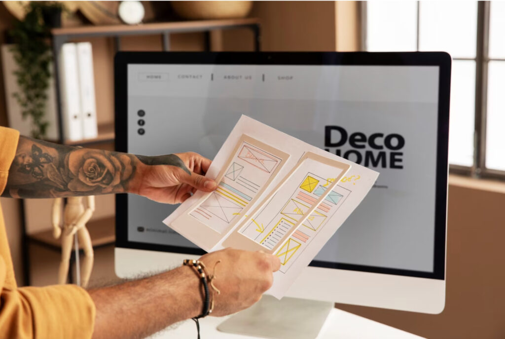
Designing Your New Website
Once you have planned the goals and user experience for your website redesign, it’s time to dive into the design phase. Follow these steps to create a visually appealing and cohesive website:
Choose a suitable template or theme that aligns with your brand
Select a template or theme that suits the overall style and objectives of your website. Consider the design elements, layout options, and functionality offered by different templates. Ensure that the template aligns with your brand’s personality and visual identity. Look for templates that provide flexibility and customization options to tailor the design to your specific needs.
Customize the layout, colors, and fonts to reflect your unique identity
Once you have chosen a template, personalize it to match your brand identity. Customize the layout, colors, and fonts to create a cohesive and visually appealing design. Pay attention to the following aspects:
- Layout: Arrange the elements on each page to create an intuitive and user-friendly flow. Ensure that important information is prominently displayed and easily accessible. Maintain consistency in the layout across different pages to provide a cohesive user experience.
- Colors: Choose a color scheme that reflects your brand’s personality and creates a visually pleasing atmosphere. Consider using your brand’s primary colors and complementary shades to establish a consistent visual identity throughout your website.
- Fonts: Select fonts that are legible and complement your brand’s tone. Choose a combination of fonts for headings, subheadings, and body text that create a harmonious and professional look. Stick to a limited number of fonts to maintain a cohesive design.
Ensure a visually appealing and consistent design across all pages
Maintain a consistent design across all pages of your website to provide a cohesive user experience. Pay attention to the following:
- Visual elements: Use high-quality images, icons, and graphics that align with your brand and enhance the overall aesthetic of your website. Ensure that visual elements are appropriately sized, optimized for fast loading, and visually appealing.
- Branding elements: Incorporate your logo, brand colors, and other visual branding elements consistently throughout the website. This will strengthen brand recognition and create a unified experience for visitors.
- White space: Utilize white space effectively to create a clean and uncluttered design. White space helps to improve readability and draw attention to important elements.
By choosing a suitable template, customizing the layout, colors, and fonts, and ensuring a visually appealing and consistent design, you will create a website that reflects your unique brand identity and engages your visitors. A well-designed website not only enhances the user experience but also helps to establish credibility and leave a lasting impression on your audience.
Optimizing for User Experience
Creating a positive user experience (UX) is paramount when redesigning your website. Here are essential steps to optimize your website for a seamless and engaging user experience:
Ensure your website is mobile-responsive for a seamless experience across devices
With the increasing use of smartphones and tablets, it’s crucial to optimize your website for mobile devices. Choose a responsive design that automatically adjusts the layout and content to fit different screen sizes. This ensures a consistent and user-friendly experience for visitors, regardless of the device they are using.
Simplify navigation and menus for easy access to information
Streamline your website’s navigation to make it intuitive and user-friendly. Consider the following:
- Clear and descriptive menu labels: Use concise and descriptive labels for your menu items. Avoid jargon or ambiguous terms that may confuse visitors. Make it easy for users to find what they are looking for.
- Organize content logically: Categorize your content in a logical manner to make it easy for users to navigate. Use submenus or dropdowns when necessary to provide a clear hierarchy of information.
- Search functionality: Implement a search bar prominently on your website to allow users to quickly find specific information or products. Ensure that the search function provides relevant and accurate results.
Optimize page loading speed to reduce bounce rates
Page loading speed significantly impacts user experience and can affect your website’s ranking in search engines. To optimize loading speed:
- Compress images: Optimize images by compressing them without compromising quality. Large image files can significantly slow down your website. Use image compression tools or plugins to reduce file sizes.
- Minify code: Minify your website’s HTML, CSS, and JavaScript files to remove unnecessary characters and reduce file sizes. This helps to improve loading speed.
- Enable caching: Implement browser caching to store certain elements of your website locally on a user’s device. This allows subsequent visits to load faster as the cached content is retrieved.
- Content delivery network (CDN): Utilize a CDN to deliver your website’s content from servers located closer to your users. This reduces latency and improves loading speed, especially for users in different geographical locations.
By ensuring your website is mobile-responsive, simplifying navigation and menus, and optimizing page loading speed, you create a user-friendly and seamless experience for your visitors. A well-optimized website enhances engagement, reduces bounce rates, and increases the chances of conversion.
By following these steps and utilizing the power of page builders, you can revamp your online presence and create a visually appealing, user-friendly website that effectively represents your brand. Remember, website redesign is an ongoing process, so continuously monitor, analyze, and make improvements based on user feedback and industry trends.
Transform your online presence today by redesigning your website with the help of page builders. Enhance user experience, attract more visitors, and achieve your online goals. Stay ahead in the digital landscape and make a lasting impression with your revamped website.
Ready to revamp your online presence? Let’s get started!