Users access websites from a variety of devices—smartphones, tablets, laptops, and desktops. Ensuring a seamless experience across all screen sizes is crucial for user satisfaction and business success. Responsive design makes this possible, and with tools like WordPress page builders, creating device-friendly websites has never been easier. In this article, we’ll explore the principles of responsive design and how to implement it using responsive design with WordPress page builders, along with actionable tips and best practices.
What is Responsive Design?
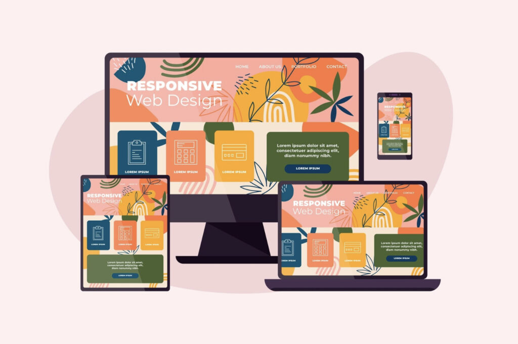
Responsive design is an approach to web development where websites automatically adapt their layout, images, and functionality to fit the screen size and resolution of the user’s device. Instead of building separate versions for mobile, tablet, and desktop, responsive design ensures one website works flawlessly across all platforms.
Why is Responsive Design Important?
Responsive design offers numerous benefits, including:
- Better User Experience: Users can navigate and interact with your website seamlessly on any device, reducing frustration and improving engagement.
- Improved SEO: Search engines like Google rank mobile-friendly websites higher, which boosts visibility and traffic.
- Cost-Effectiveness: With one design serving all devices, you save time and resources on development and maintenance.
How WordPress Page Builders Support Responsive Design
WordPress page builders provide a user-friendly way to design websites without requiring coding skills. These tools include features that make implementing responsive design simple and effective. Whether you’re a beginner or an expert, WordPress page builders enable you to create websites that look great on any screen size.
Key Features of WordPress Page Builders for Responsive Design
- Drag-and-Drop Interfaces: Page builders like Elementor and Divi offer intuitive drag-and-drop editors, allowing you to adjust elements easily to fit different devices.
- Responsive Preview Modes: These modes let you switch between desktop, tablet, and mobile views to see how your site looks and performs on various devices.
- Customizable Breakpoints: Breakpoints define the screen sizes at which the layout adjusts. With tools like Elementor, you can customize these settings to fine-tune your design.
- Prebuilt Responsive Templates: Many page builders include templates optimized for responsiveness, giving you a head start.
Steps to Create a Responsive Design with WordPress Page Builders
Creating a responsive website involves strategic planning and effective use of the tools available in WordPress page builders. Here’s a step-by-step guide to help you get started:
Step 1: Choose the Right Theme and Page Builder
Start by selecting a responsive WordPress theme that complements your design goals. Themes like Astra and OceanWP are designed to work seamlessly with page builders such as Elementor, Divi, and Beaver Builder, providing a solid foundation for responsiveness.
Step 2: Utilize Built-In Responsive Tools
Leverage the responsive design settings in your page builder. These tools let you adjust font sizes, margins, and padding for different devices. For example, you can create a mobile-friendly navigation menu or ensure images resize dynamically for smaller screens.
Step 3: Optimize Images and Media
Large image files can slow down your site, especially for mobile users. Use tools like TinyPNG to compress images and enable responsive image settings in your page builder to ensure fast loading times.
Step 4: Test Responsiveness Regularly
Testing is a critical part of the design process. Use your page builder’s preview mode to check how your site appears on various devices. Combine this with external tools like Google’s Mobile-Friendly Test for a comprehensive evaluation.
Best Practices for Responsive Design
To create a website that performs well across all devices, follow these best practices:
- Keep Layouts Simple
Complex layouts may look great on desktops but can appear cluttered on smaller screens. Prioritize simplicity and functionality. - Use Scalable Fonts
Ensure readability on all devices by using relative units like “em” or “rem” for font sizes. This approach adjusts text size dynamically based on the screen. - Prioritize Mobile-First Design
Designing for smaller screens first ensures that essential elements are optimized for mobile users, which often make up the majority of website traffic. - Test Across Devices and Browsers
Regularly test your website on a variety of devices and browsers to identify and fix issues that might affect user experience.
Common Mistakes to Avoid
Even with the best tools and intentions, some common pitfalls can hinder the effectiveness of responsive design:
- Overcomplicating Layouts
Using overly intricate designs can make your site harder to navigate on smaller screens. Focus on clean, user-friendly layouts. - Neglecting Performance Optimization
Failing to optimize images, scripts, and other assets can lead to slow loading times, which frustrates users and negatively impacts SEO. - Skipping Thorough Testing
Relying solely on page builder previews may result in missed issues. Always test your site using real devices to ensure consistent performance.
Conclusion
Responsive design is essential for delivering a seamless user experience in a world where devices vary widely in size and functionality. With the capabilities of responsive design with WordPress page builders, even those without technical expertise can create stunning, device-friendly websites. By following the steps, best practices, and avoiding common mistakes outlined in this article, you can ensure your website is both user-friendly and future-proof. Embrace responsive design today and elevate your website’s performance and user engagement!